kubenav - Kubernetes Dashboard
- 4.4
- Rating
- 10.00K
- Installs
- Free
- Price

 Analysis by App-foxy
Managing Kubernetes from a phone sounds like a compromise until the moment a production alert arrives while I am away from my desk. That is where kubenav makes sense. It is a free Kubernetes dashboard app for Android and iOS, created by Rico Berger, and it puts cluster navigation into a compact mobile interface rather than asking me to open a full desktop console.
I approached it as a practical companion, not as a replacement for every tool in a platform engineer’s workflow. The app belongs to the Libraries & Demo area, carries an Everyone age rating, and has reached over ten thousand installs with a 4.4 average from roughly one hundred sixty ratings. Those figures suggest a focused audience rather than a mass-market utility, which matches my experience: this is aimed at people who already understand Kubernetes and want access to cluster information when a laptop is inconvenient.
The current release is version 5.5.0 and supports Android 7.0 or later. The app itself is free, although in-app purchases range from $0.99 to $9.99 per item. That combination makes it easy to try before deciding whether it belongs in a regular on-call routine. My main question was not whether a phone can display Kubernetes objects, but whether the result remains readable, controllable, and useful under pressure.
You May Also Like

 Pandora - Music & Podcasts
Pandora’s Music Is Easy to Start, but Harder to Recover
Pandora’s strength is its low-effort path from a seed to a station. Its weak spot is how much confidence it asks you to place in connection, setup, and quiet recovery.

 8 Ball Pool
 Is Built on Rivalries, Rematches, and Routine
A close look at the rivalries, rematches, shared routines, and unanswered safety questions that turn a quick pool match into a persistent mobile community.

 Samsung Music
’s Quiet Strength Is Playing What You Already Own
Its reach comes less from spectacle than from dependable access to a personal library. That simplicity is both the app’s strongest retention engine and its ceiling.

 AccuWeather: Weather Radar
AccuWeather Review: A Quick, Clear Forecast for Everyday Decisions
For everyday plans, the best forecast is the one you can understand quickly. AccuWeather makes rain timing, radar, and local conditions easy to act on, with a few trade-offs.

 Hill Climb Racing
Why Hill Climb Racing Still Turns Crashes Into One More Run
A tiny car, a bumpy hill and one more upgrade: Hill Climb Racing keeps resurfacing because its simple chaos makes every near-miss feel personal.

 AliExpress - Shopping App
AliExpress Makes Global Shopping Feel Personal, but Shoppers Bear the Risk
AliExpress turns a global marketplace into a pocket-sized discovery engine. Its reach is useful, its shopping loop compelling, and its trade-offs easy to miss.
More From Our News Desk
View All News


How kubenav works when the screen and situation are not ideal
When I’m away from a desk, the hardest part is not simply fitting cluster information onto a phone; it’s staying deliberate when glare, movement, or a distracted moment makes details easier to miss. I use those conditions as a reason to narrow the task: identify the one resource I need to check, pause somewhere stable, and verify its name before opening it. That practical approach leads to a larger question: which Kubernetes checks truly benefit from mobile access?
Readable navigation for a dense technical environment
The first thing I noticed is that a Kubernetes cluster contains far more information than a phone screen can comfortably show at once. Pods, deployments, services, namespaces, nodes, events, and configuration objects all compete for attention. A mobile dashboard therefore lives or dies by how quickly I can move from a broad view to the object that needs checking.
kubenav’s value is its direct relationship with the cluster rather than a simplified “health score” view. For someone who already knows the difference between a pod restart and a failing deployment, that is useful. I can think in Kubernetes objects instead of translating a generic notification into a second tool. The app feels most natural when I am inspecting a known namespace or following a familiar troubleshooting path.
That strength also creates a readability limit. Technical resource names are often long, similar, and full of punctuation. On a handset, a name that is obvious in a wide terminal or desktop dashboard can become visually crowded. I found it important to slow down before selecting an object, especially when several replicas or services have nearly identical names. This is not a defect unique to the app; it is the unavoidable cost of bringing cluster administration to a small display.
For users with reduced vision, the practical question is whether the phone’s own display scaling and magnification settings make the interface comfortable. I would test that before relying on it during an incident. Larger text can improve legibility, but it may also force more scrolling and make long resource names harder to compare. The app is therefore more suitable for deliberate inspection than for scanning a large amount of dense information at once.
I also recommend using a consistent naming approach in the clusters you manage. Clear namespace and workload names help far more on a phone than on a desktop, where extra width and multiple panels can compensate for ambiguity. A useful mobile workflow starts before the app opens: if every object has a similar, cryptic name, navigation will remain tiring regardless of the dashboard.
Touch control, precision, and the cost of small targets
Touch interaction changes the way I work with Kubernetes. On a laptop, a precise pointer and keyboard shortcuts make it easy to move through lists, select text, and compare values. On a phone, every tap is more deliberate. This matters when a screen contains several nearby rows or when I need to open one resource without losing the surrounding context.
For people with limited fine-motor control, tremors, or difficulty maintaining a steady touch, kubenav may be comfortable for viewing but less comfortable for rapid administration. The app’s usefulness depends on how much interaction is required in a particular task. Checking a pod’s state is a very different experience from navigating several nested screens or attempting a change while standing, walking, or holding the phone in one hand.
My advice is to treat the app as a monitoring and inspection tool first. If I need to make a high-consequence change, I prefer a stable surface, two hands, and enough time to verify the selected resource. A phone makes accidental selection easier to imagine, particularly in a busy cluster. That is a human-factors concern rather than a claim that the app performs unsafe actions, but it is an important trade-off for anyone managing shared infrastructure.
Voice control and built-in assistive technologies may help with parts of the experience, but technical dashboards are difficult to operate entirely through speech. Resource names, namespace names, and command-like terminology are not always easy to dictate or hear correctly. Users who depend on a screen reader should test the actual navigation path they need, rather than assuming that a visually clear screen will expose every control in the same order to assistive software.
One practical adjustment is to do the exploratory work at a desk and reserve the phone for a short, known sequence. For example, I might decide which namespace and deployment I want to inspect before leaving the computer. That reduces the number of taps and lowers the chance of selecting the wrong similarly named object. It also makes the app more accessible to users who find open-ended touch navigation tiring.
Situational access: where a mobile dashboard earns its place
The strongest use case is a quick check away from a workstation. Imagine receiving a message that a service is behaving slowly while travelling between meetings. I can open the app, inspect the relevant cluster, check whether the expected pods are present, and look for an obvious mismatch between the workload and its current state. That does not replace a full incident investigation, but it tells me whether I need to find a laptop immediately.
Another useful situation is a planned maintenance window where I want a second view without staying next to the main console. A phone can act as a lightweight observation point while I monitor whether resources settle into the expected state. I would still keep the primary terminal or desktop dashboard available for logs, editing, and detailed comparison, but the mobile view can reduce the need to switch constantly between rooms or screens.
This flexibility is especially helpful for small teams, students, and administrators who manage clusters but do not spend every hour inside Kubernetes. The app gives those users a way to stay connected without carrying a complete workstation. It is also a more realistic option for people who work across different locations and need a compact tool for status checks.
Situational access has limits. A phone depends on a network path to the cluster and on an authentication setup that is appropriate for mobile use. I would not design an emergency process around an untested connection or assume that a dashboard can solve a networking problem that prevents access in the first place. Before relying on it for on-call work, I would test it from the places where I am genuinely likely to use it, including weak-signal areas and outside the office.
Privacy is another consideration in public spaces. Cluster names, workload names, and operational details can appear on a screen that other people may see. A user who works with sensitive infrastructure should think about screen visibility, device locking, and whether a quick inspection in a public place is appropriate. The mobile form factor improves availability, but it also makes the information more portable.
What it does well for different abilities and working styles
I see kubenav as most inclusive when it reduces dependence on a fixed workstation. Someone who cannot comfortably remain at a desk for long periods may appreciate being able to perform a brief check from a preferred location. Likewise, a user who finds a large desktop interface overwhelming may prefer a narrower path through the cluster, provided the required resource is easy to locate.
The app can also support different attention patterns. A short mobile check may be easier than opening a full development environment for one question. That is valuable for a person who needs to conserve cognitive energy, is moving between tasks, or is working under time pressure. The benefit is not that the Kubernetes model becomes simple; it is that the access point becomes more immediate.
At the same time, the app is not a beginner-friendly abstraction over Kubernetes. Its usefulness assumes that I already understand what I am looking at. A new user may see resource names and states without knowing which one matters, what a warning means, or whether a change is safe. For learners, a desktop tutorial environment or a guided Kubernetes platform may be better because it provides more room for explanation and comparison.
Users with color-vision differences should avoid depending on visual color alone when interpreting a resource’s condition. I would confirm the actual text, status, and surrounding details rather than treating a color cue as the entire diagnosis. That is a sound habit for any operational dashboard, and it matters even more on a small screen where visual distinctions can be subtle.
Three workflows that make the mobile format more useful
The first workflow is a namespace-first check. Before opening the app, I decide which application or environment I am investigating. Once inside, I stay focused on that namespace instead of browsing the entire cluster. This reduces visual noise, makes similarly named resources easier to distinguish, and turns a general dashboard into a short inspection route.
The second is a symptom-to-object workflow. If a service appears unhealthy, I start with the workload that should provide it, then inspect the related resources and current state rather than jumping randomly through the cluster. On a phone, this order matters because backtracking through many screens is slower and more error-prone than it is on a desktop. The app is most effective when I bring a hypothesis with me.
The third is a verification workflow after a change made elsewhere. I use the mobile app to confirm that the expected resources appear and that the cluster is moving toward the intended state. I do not use a quick phone glance as proof that a deployment is fully healthy. Instead, I treat it as an early confirmation step, followed by deeper checks when the situation is important.
These workflows reveal a useful trade-off: kubenav is better at shortening the distance to known information than at replacing a complete investigation. If I know what I want to inspect, the phone is convenient. If I am unsure whether the problem involves networking, configuration, logs, scheduling, or permissions, the limited screen becomes a real constraint.
Remaining barriers before making it part of an on-call routine
The largest barrier is Kubernetes complexity itself. A dashboard can present objects, but it cannot remove the need to understand namespaces, controllers, workload relationships, and operational consequences. People who expect a polished consumer-style experience may find the app demanding, even though experienced administrators may appreciate the directness.
Screen size is the second barrier. Comparing several resources, reading long values, and keeping context while moving between views are all easier on a desktop. I would not choose the phone as my only interface for a serious migration, a complicated outage, or a task involving extensive configuration review. The app complements a larger setup; it does not make that setup unnecessary.
There is also a difference between observing and acting. Mobile access is attractive because it is always nearby, but convenience can encourage rushed decisions. I would establish a personal rule: use the app to understand the situation, and make consequential changes only when I can verify the target and the result carefully. That rule is particularly important for users with motor, visual, or attention-related challenges, because a smaller interface leaves less room for recovery from a mistaken tap.
Compared with a browser-based Kubernetes dashboard, kubenav is more convenient when I want a dedicated mobile experience and less convenient when I need broad workspace layout, extensive text entry, or several views side by side. Compared with command-line tools, it is easier to approach visually but less efficient for repeatable commands and expert keyboard-driven work. Compared with general monitoring apps, it offers a Kubernetes-oriented perspective rather than only presenting alerts or charts. Choosing it depends on whether direct cluster navigation is more valuable to me than automation, wide-screen context, or specialized observability.
The purchase model is worth checking before building a team workflow around every capability. The app is free to install, while individual in-app purchases are listed between $0.99 and $9.99. I would begin with the free experience, identify the exact tasks I need, and then decide whether an optional purchase improves that workflow. That is a better approach than paying first and discovering that my main requirement is actually better served by a terminal or desktop dashboard.
My inclusive verdict for Kubernetes access on a phone
After using kubenav as a mobile companion, I would recommend it to an experienced Kubernetes user who wants quick cluster visibility away from a desk. Rico Berger’s app is particularly appealing for on-call checks, travel, maintenance observation, and small troubleshooting steps where opening a full workstation would be excessive. Its focused design can also suit people who prefer a shorter, less sprawling route through technical information.
I would be more cautious about recommending it as the sole tool for beginners, complex incidents, or users who need generous spacing, extensive text entry, or highly predictable assistive-technology navigation. The phone format creates genuine barriers around dense names, small-screen comparison, precision tapping, and sustained attention. Device-level accessibility settings may improve the experience, but they cannot change the underlying complexity of Kubernetes or provide the workspace of a desktop.
My practical recommendation is to install the free app, connect it in a controlled setting, and rehearse one or two real workflows before depending on it. Test the cluster you actually manage, the network you actually use, and the accessibility settings that matter to you. If the app lets you answer routine questions quickly without encouraging rushed changes, it has earned a place beside your main tools.
In the end, kubenav is not a miniature replacement for every Kubernetes console. I see it as a focused bridge between “I need to know what is happening” and “I can get to a full workstation.” For the right user, that bridge is genuinely useful. Its inclusive value comes from making cluster information more reachable in different places and working styles, while its limitations are clear enough to respect: mobile access improves availability, but careful Kubernetes judgment still matters more than the screen it appears on.
FAQs for kubenav - Kubernetes Dashboard
01What is kubenav and how does it work?
Kubenav is a mobile dashboard application designed for Kubernetes clusters, providing users with an interface to manage and monitor their Kubernetes resources. It aggregates data from multiple clusters, offering insights into workloads, configurations, and performance metrics. The app is compatible with both Android and iOS, making it accessible for on-the-go cluster management.
02Is kubenav secure to use with my Kubernetes clusters?
Yes, kubenav ensures secure access to your Kubernetes clusters by supporting authentication methods such as token, username/password, and client certificates. It uses secure connections to communicate with the Kubernetes API server, ensuring that your data remains protected at all times during interactions.
03Can I manage multiple clusters with kubenav?
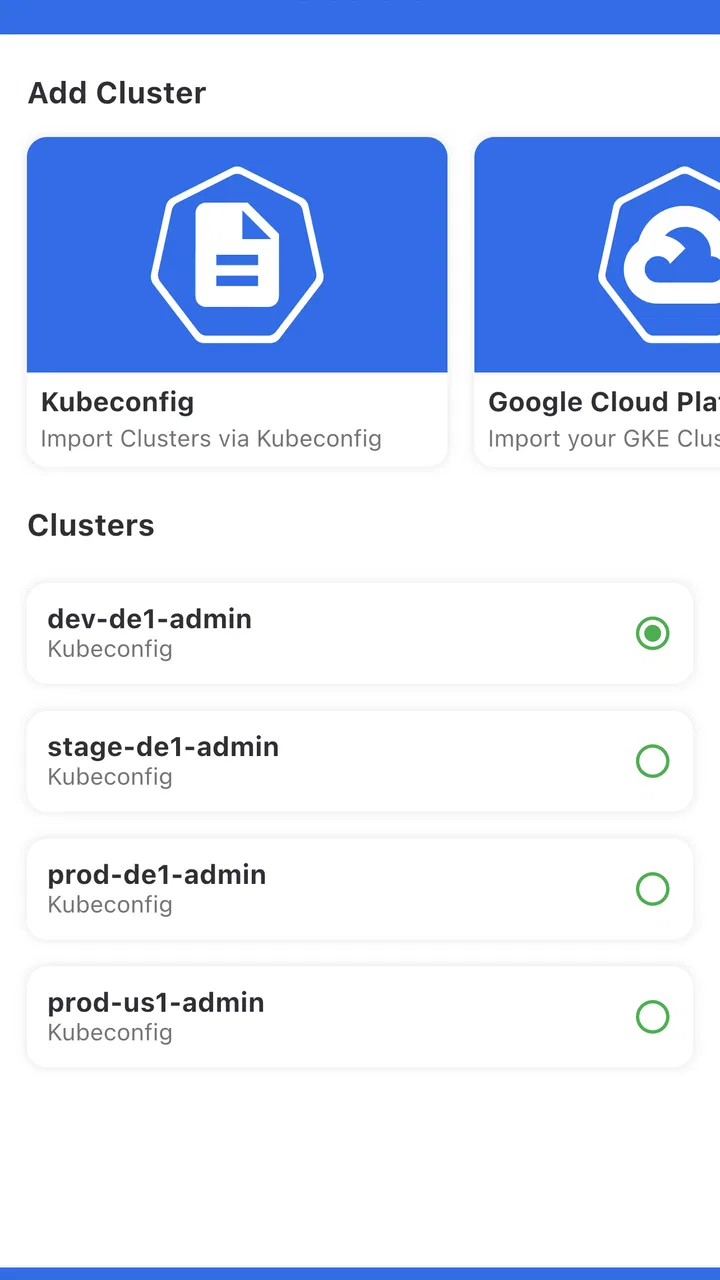
Absolutely. Kubenav supports managing multiple Kubernetes clusters from a single interface. Users can easily switch between clusters and view resources, logs, and events specific to each cluster. This feature is particularly useful for DevOps teams handling multiple environments or staging and production setups.
04Does kubenav support custom resource definitions (CRDs)?
Yes, kubenav provides support for custom resource definitions (CRDs). It allows users to view and manage custom resources alongside standard Kubernetes resources, offering flexibility for users who have extended their Kubernetes clusters with CRDs for specialized tasks or integrations.
05Are there any prerequisites for using kubenav on my mobile device?
To use kubenav, ensure your mobile device runs on Android or iOS. Additionally, you must have access to a Kubernetes cluster with the necessary credentials for authentication. It’s also recommended to have some basic knowledge of Kubernetes to effectively utilize the features offered by kubenav.
Pros
- Intuitive UI simplifies complex Kubernetes tasks.
- Supports multiple Kubernetes providers seamlessly.
- Real-time monitoring with detailed resource insights.
- Offline mode enhances accessibility on-the-go.
- Customizable alerts keep you informed instantly.
Cons
- Initial setup can be tedious for beginners.
- Limited integration with non-Kubernetes services.
- Advanced features may require a learning curve.
- Occasional lag with large clusters.
- UI lacks dark mode for night use.

kubenav - Kubernetes Dashboard
Gallery